Visualizing Archives
We got in touch with Leah Day in the Spring of 2022 on her thesis research on ‘Visualizing Archives’. Leah's findings and charts have been on our minds as The People’s Graphic Design Archive (PGDA) continues to expand on a more complete version of graphic design history. This piece summarizes Leah's research and is a great resource for others entering the digital design archive space.
Approaching the Digital Archive
William A. Dwiggins is credited with first coining the term “graphic design” in 1922. When I was writing my MFA thesis in the spring of 2022, the merging of those four syllables—graphic design—was turning one hundred years old. It seemed like a fitting time to consider the ways in which we preserve design history. I began to follow a line of questions—What kinds of design artifacts are being preserved? Who’s preserving them? How do we add new artifacts to historical archives? How do we determine which artifacts are added?
At the time, my reliance on video calls, virtual collaboration, and online classes during the pandemic also had me considering digital tools in ways I hadn’t before. This influence and my interest in design artifacts focused my thesis.
I was fascinated by comparing a digital archive’s version of design history to that of a design textbook. In books, artifacts are typically mentioned within a traditional art-historical narrative. That is, designed things are presented in a series of eras featuring famous makers and their exemplary work. In this version of design history, artifacts are held together by narrative. In archives, however, artifacts typically exist as islands. Digital archives help us focus on one artifact at a time, yet it becomes more difficult to notice trends in the archive as a whole. This makes sense because archives are typically focused on preservation, not explanation or narrative.
I became convinced that a visualization could be an appropriate tool to help us think about archives. My line of questions narrowed to just one: How might a visualization help us understand 1) an archive as a whole and 2) one archive in relation to another?
My research looks at three digital design archives: the People’s Graphic Design Archive (crowdsourced), the Letterform Archive (curated), and the AIGA Design Archives (juried). I designed a visual system to help spot general trends within these three archives. You can find my whole thesis here, in which I also look at ways that history has been visualized in the past. For the sake of this post, I’ll be focusing on my findings with the People’s Graphic Design Archive (PGDA).
Charting Archives
My system for visualizing archives began with handwritten notes and a series of spreadsheets and eventually took the shape of a chart with a detailed legend. Below is a chart that shows my system applied to PGDA artifacts. This visual taxonomy focuses on artifact qualities (type of artifact, print vs. digital, process vs. final, etc.) the number of photos or videos that accompany an artifact entry, as well as the artifact’s creator and contributor. It’s important to note that this chart represents only 50 artifacts from the PGDA—the most recently added artifacts at the time I made the visualization.
This was a manageable data set for me at the time—if I revisit the project, I would thoroughly explore scalability. Nevertheless, we can start to gain insights from this chart. By applying the visual system to these artifacts, trends start to become immediately apparent. For instance, we might first notice the larger orange and pink circles. Using the legend on the right side of the chart, we discover that the archive must have more Ephemera and Publication artifacts than other artifact types.
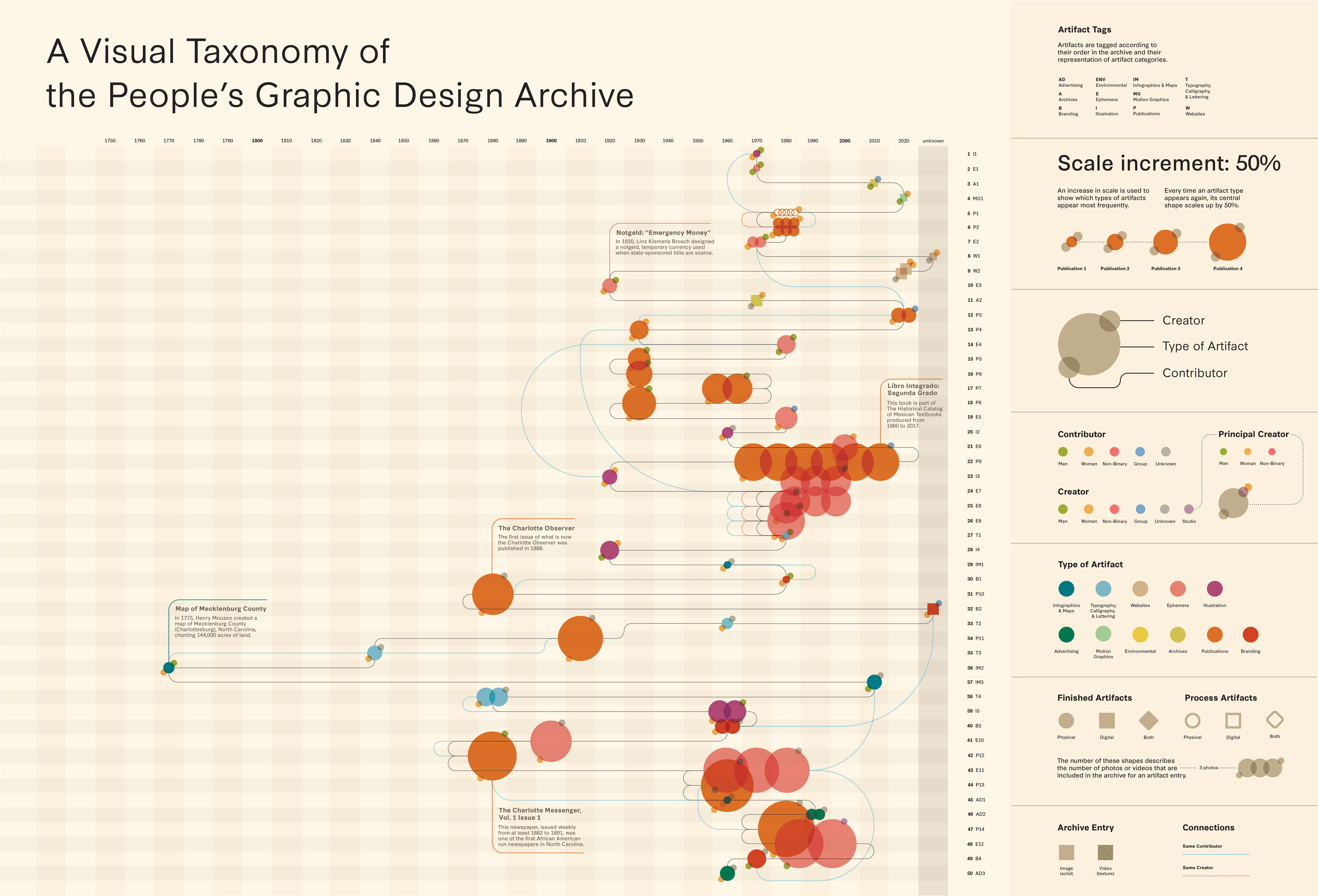
Visualizations like this one for the People’s Graphic Design Archive can help give a sense of an archive’s construction.
While orange and pink appear the most, we also see a variety of colors throughout the chart. In fact, the 50 artifacts on the chart represent ten of the eleven artifact categories (Advertising, Branding, Websites, etc.).
The horizontal spread of artifacts is also notable—referencing the timeline at the top of the chart, we see that most artifacts are from 1960 onward with an outlier from 1770. In general though, these artifacts have a fairly even spread across decades, with perhaps a focus on the 1970s onward. Of course, we can’t confidently make generalizations for the entire archive based on this sampling of 50 artifacts. However, we can get a sense of the archive’s construction, especially when we see other archives represented with the same system alongside the PGDA chart. Below are charts for the Letterform Archive and the AIGA Design Archives.
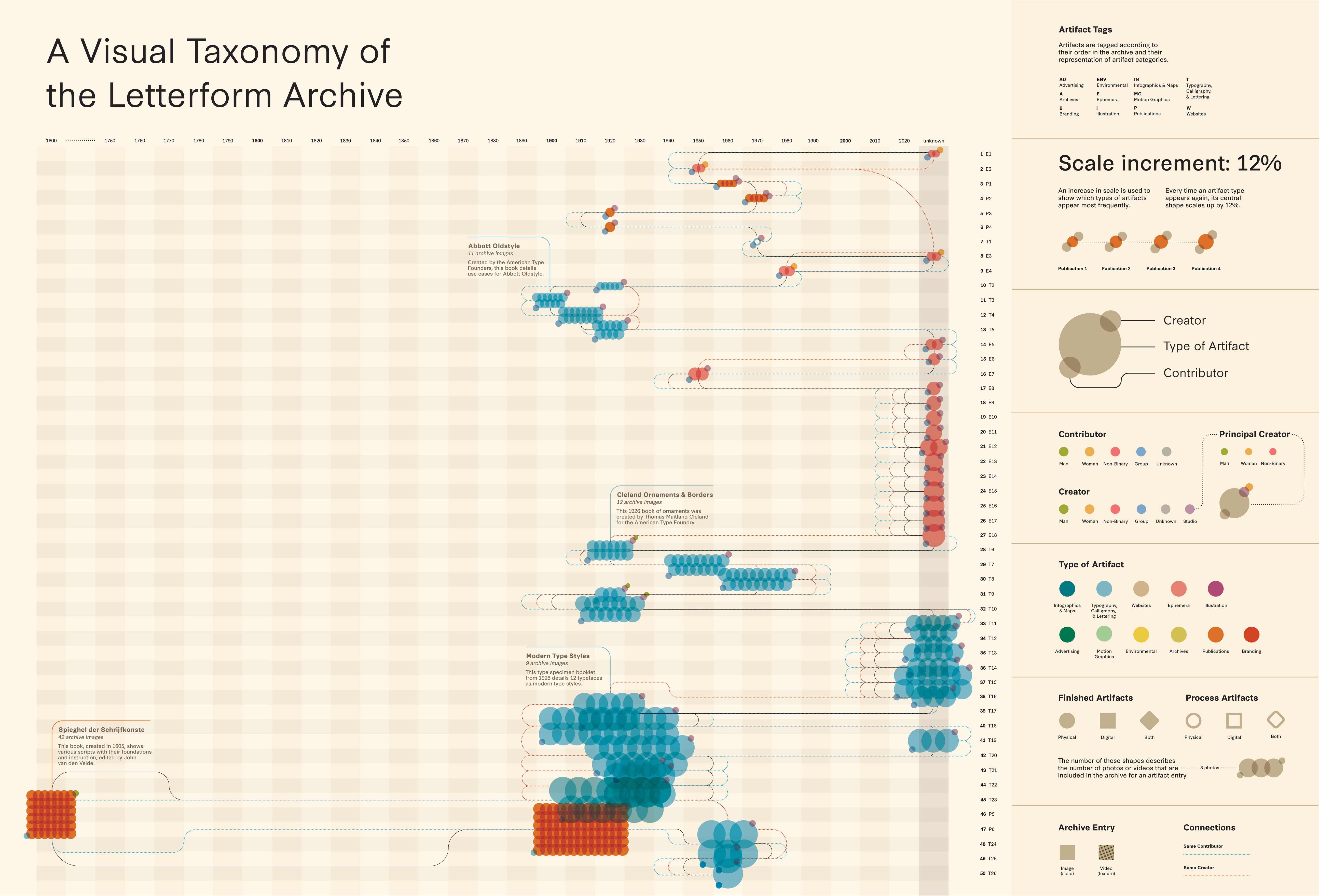
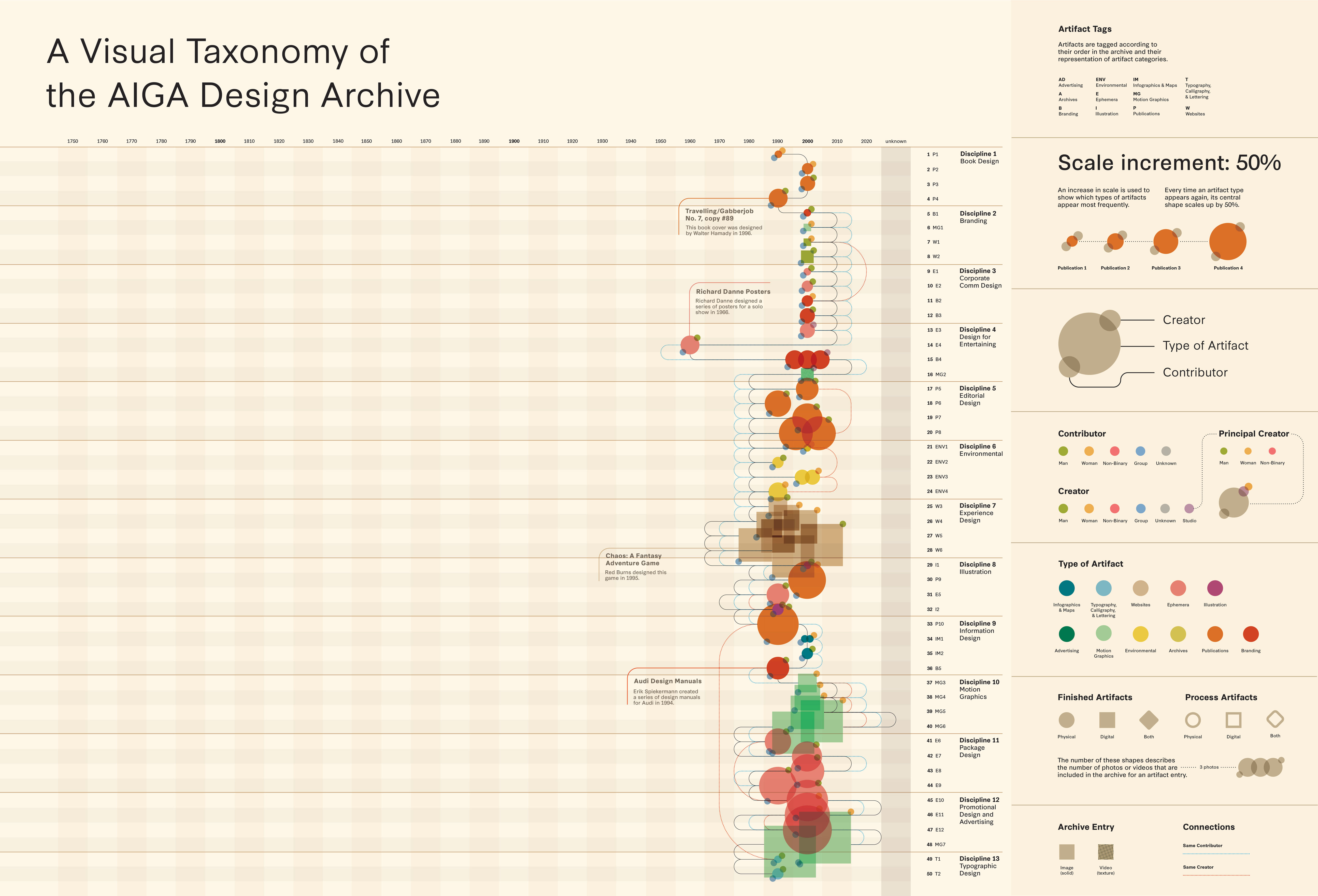
Viewing the charts vertically along the decade columns can help us understand which eras of design history an archive represents.
Findings
It’s not necessarily a concern that the charts look very different. Visualizations like these could be used to evaluate an archive’s mission. For example, of the three charts, the PGDA boasts the most diverse array of artifacts, eras, makers, and contributors.
On the About page of this website, you’ll find the PGDA’s mission: “Our goal is to realize a virtual archive that recognizes and preserves graphic design's and culture’s expansive and inclusive history.” The sampling of artifacts in the chart are a testament to the archive’s intent—here, mission aligns with archive content. This is an archive with vitality and breadth. The PGDA can account for the quirkiness and profoundness of made things because it accounts for the people who make and enjoy them.
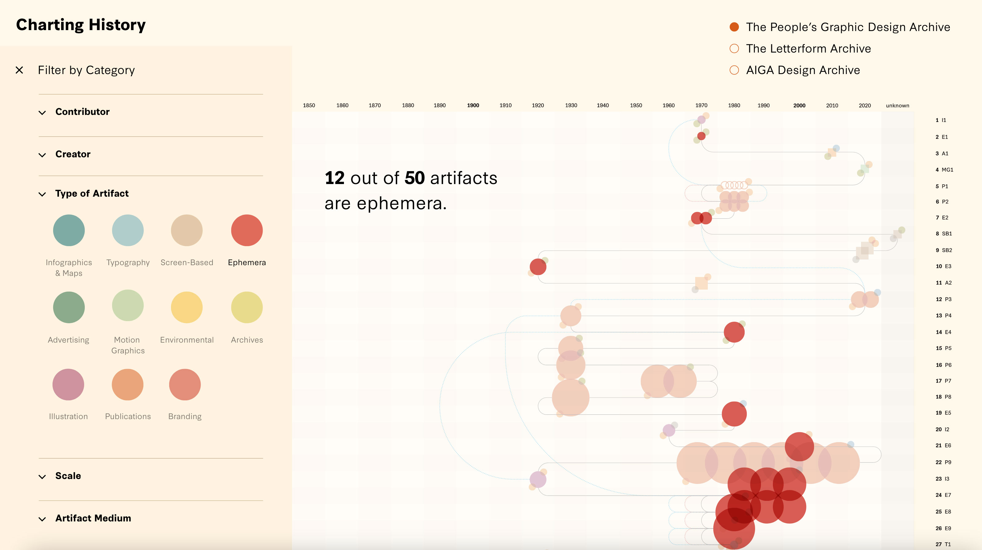
This interactive prototype allows viewers to filter archive visualizations by artifact type, creator, contributor, and more.
Interactive Charts
In addition to the static charts, I also created an interactive prototype as part of my research. An added level of interactivity allows the viewer to filter artifacts and isolate trends with a details-on-demand view of the archives. It’s exciting to think about how an interactive visualization like this might exist alongside or even within an archive. Could we even directly compare one archive to another through an interactive visualization?
Future History
I was able to discuss this project with PGDA Co-Directors Louise Sandhaus, Briar Levit, Brockett Horne, and Morgan Searcy in the spring of 2022. Our conversation underscored the value of not only creating new ways of approaching history, but also analyzing those new ways as we go. Levit noted that “the only way that we can improve on how we’re teaching or studying history is by studying how we’re teaching it or how we’re collecting it.” Sandhaus added that “ultimately to get to new narratives we need tools and data to help make these new narratives and stories possible.” We must continue to analyze the systems that collect and order design history.
In the People’s Graphic Design Archive, history becomes personal. Here, we have a direct hand in shaping what is remembered, noticed, preserved, brought to the surface, and enjoyed—this archive deserves our attention. The more context with which we can surround ourselves from the past, the more clearly we can see our present, and the more intentionally we can shape the future of design history.
--
Connect with Leah on LinkedIn and read her full thesis here.